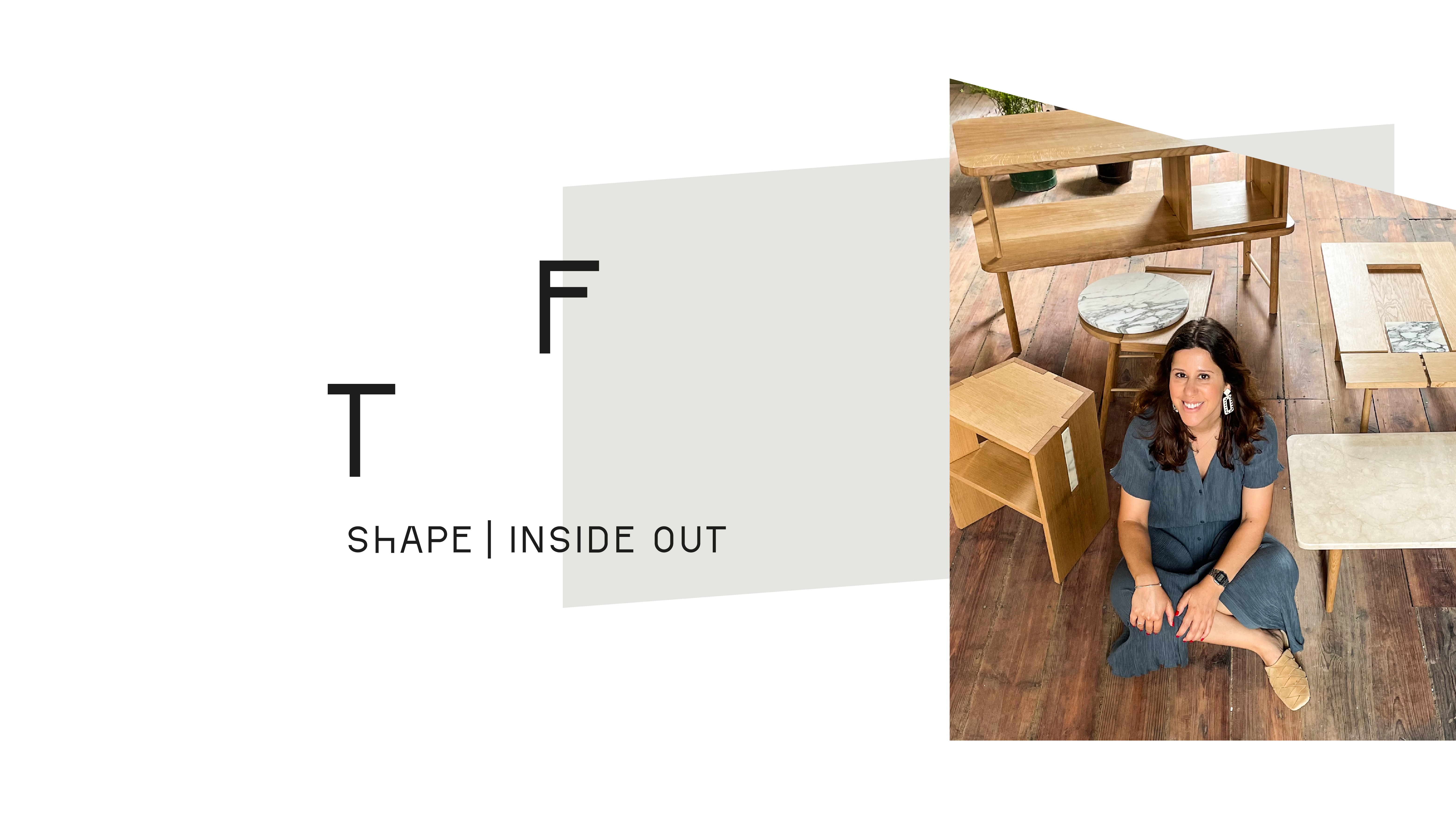
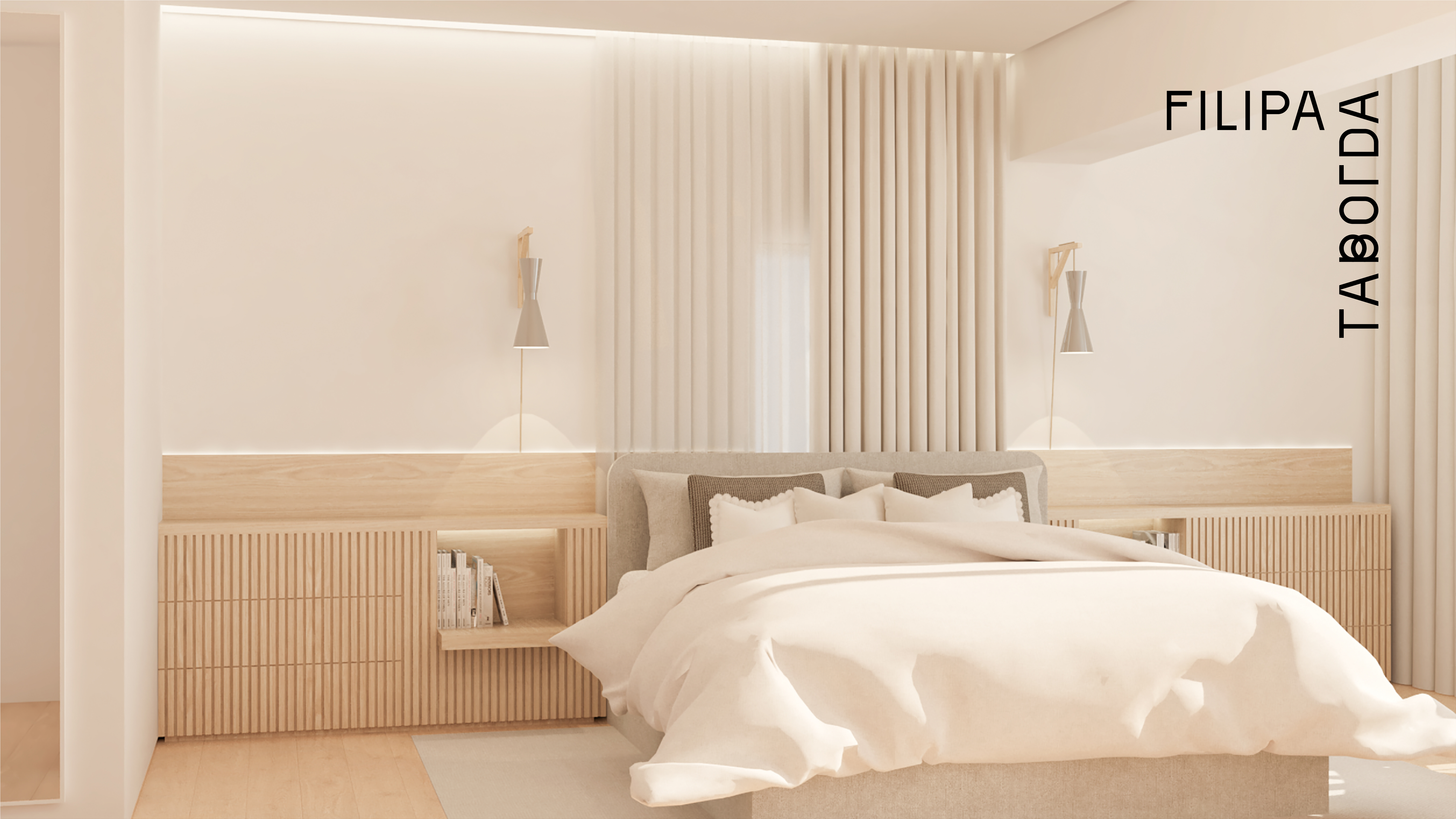
This project was built around a simple idea: spaces are not just physical structures, they are places where relationships are formed and lived.
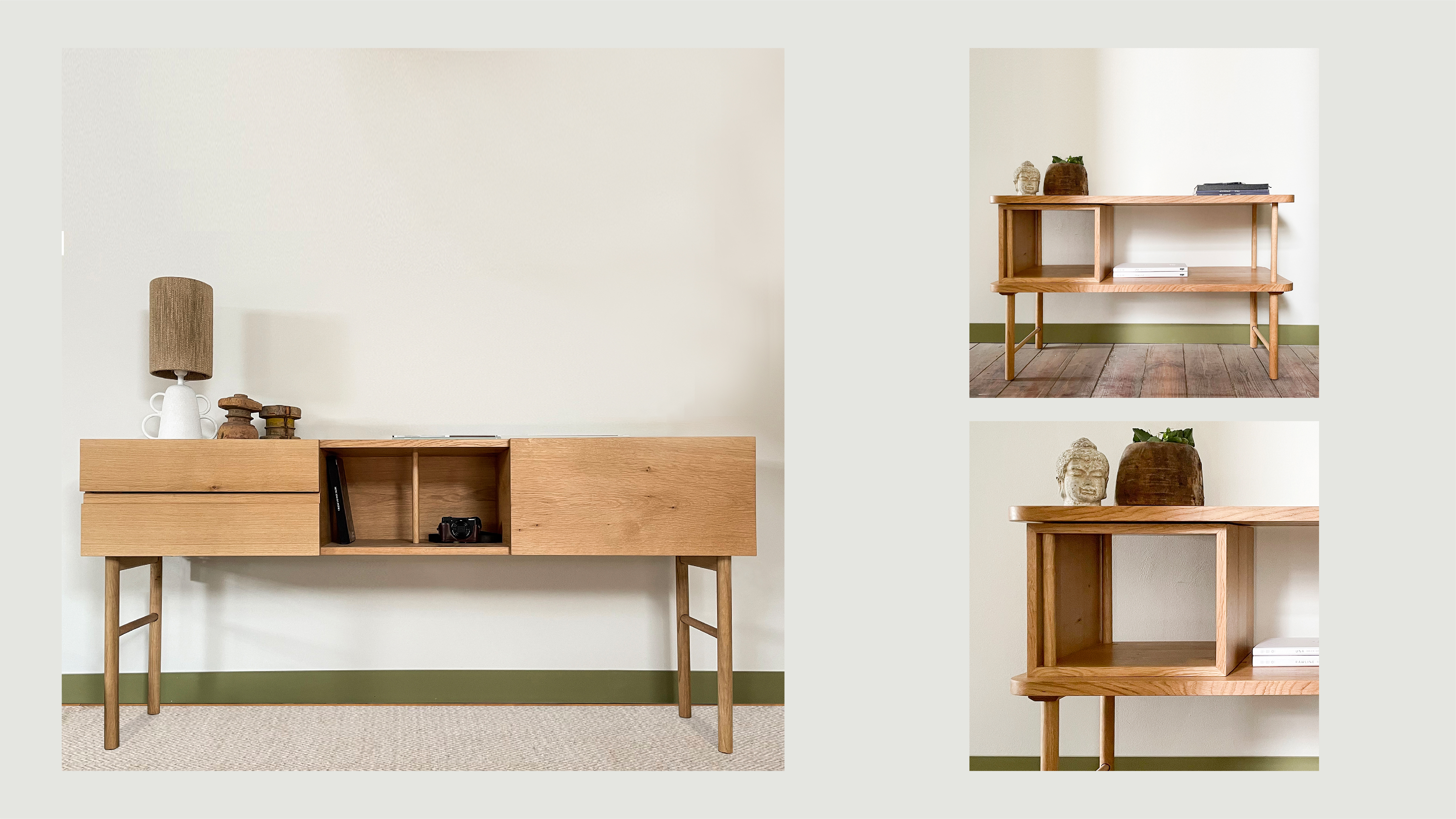
Filipa Taborda approaches architecture in a deeply human way, seeing each project not as an object, but as a personality. Every space is shaped by the people who inhabit it, their habits, their rhythms, and the way they experience their surroundings. This perspective became the foundation for the brand.
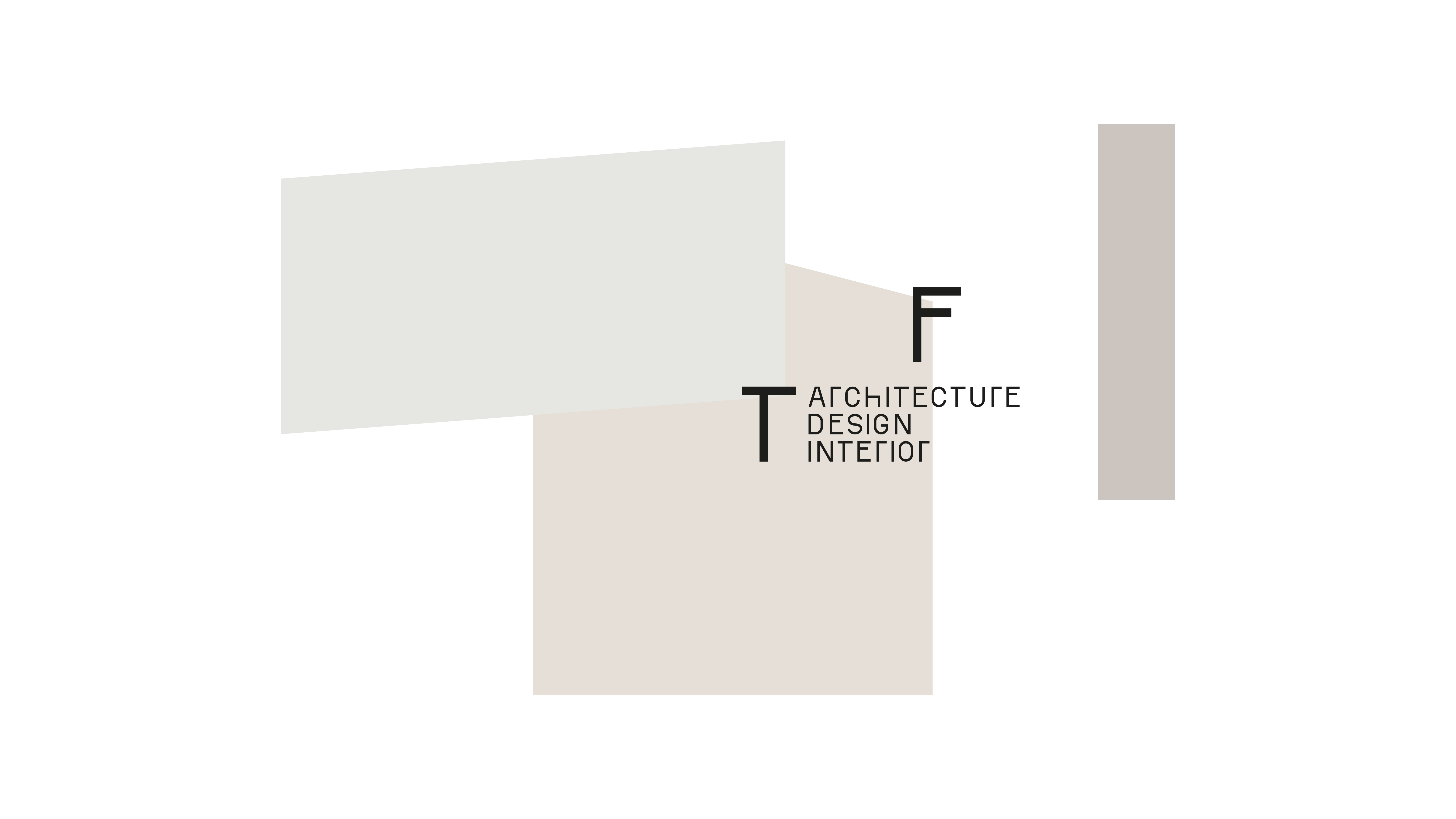
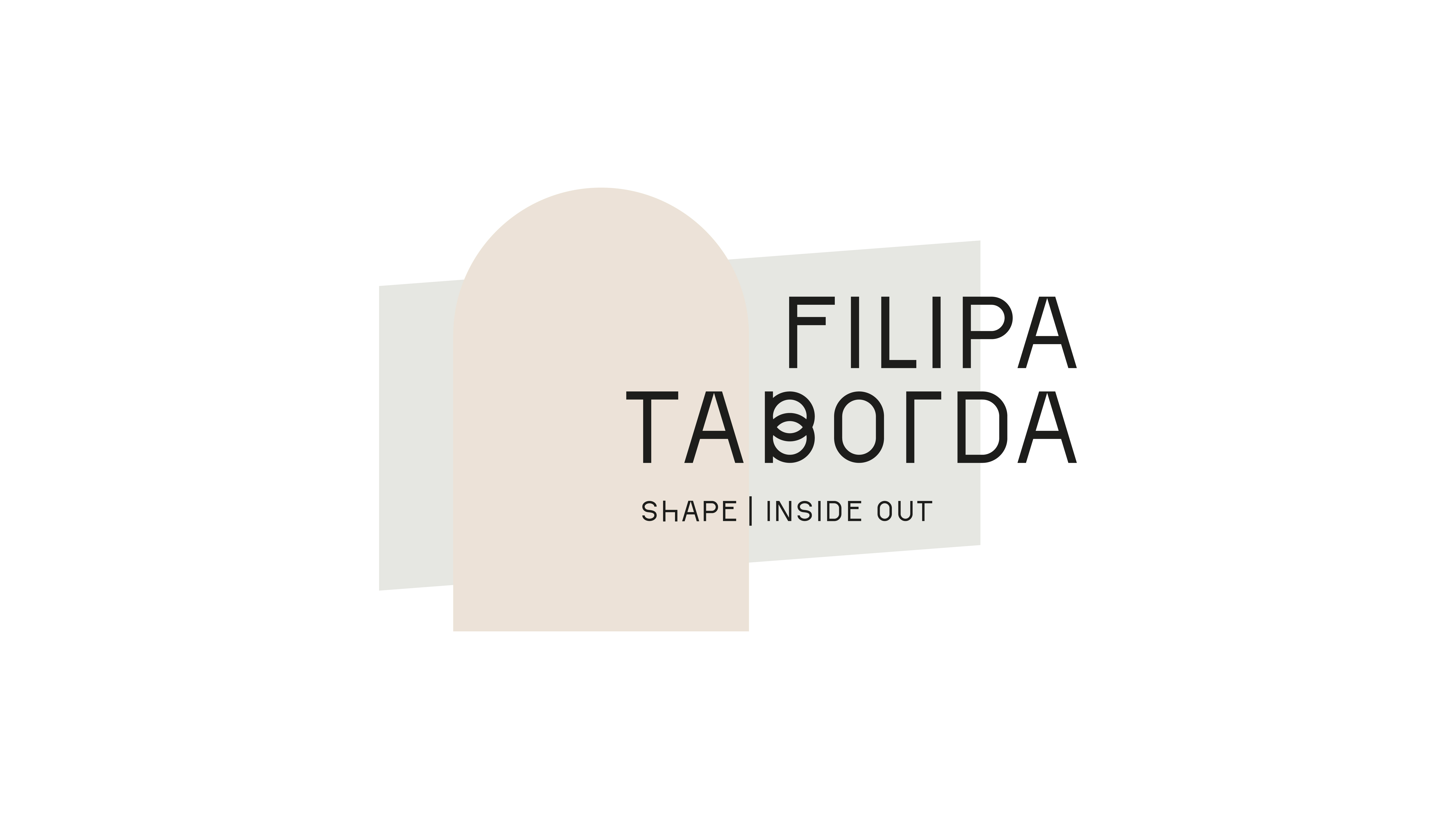
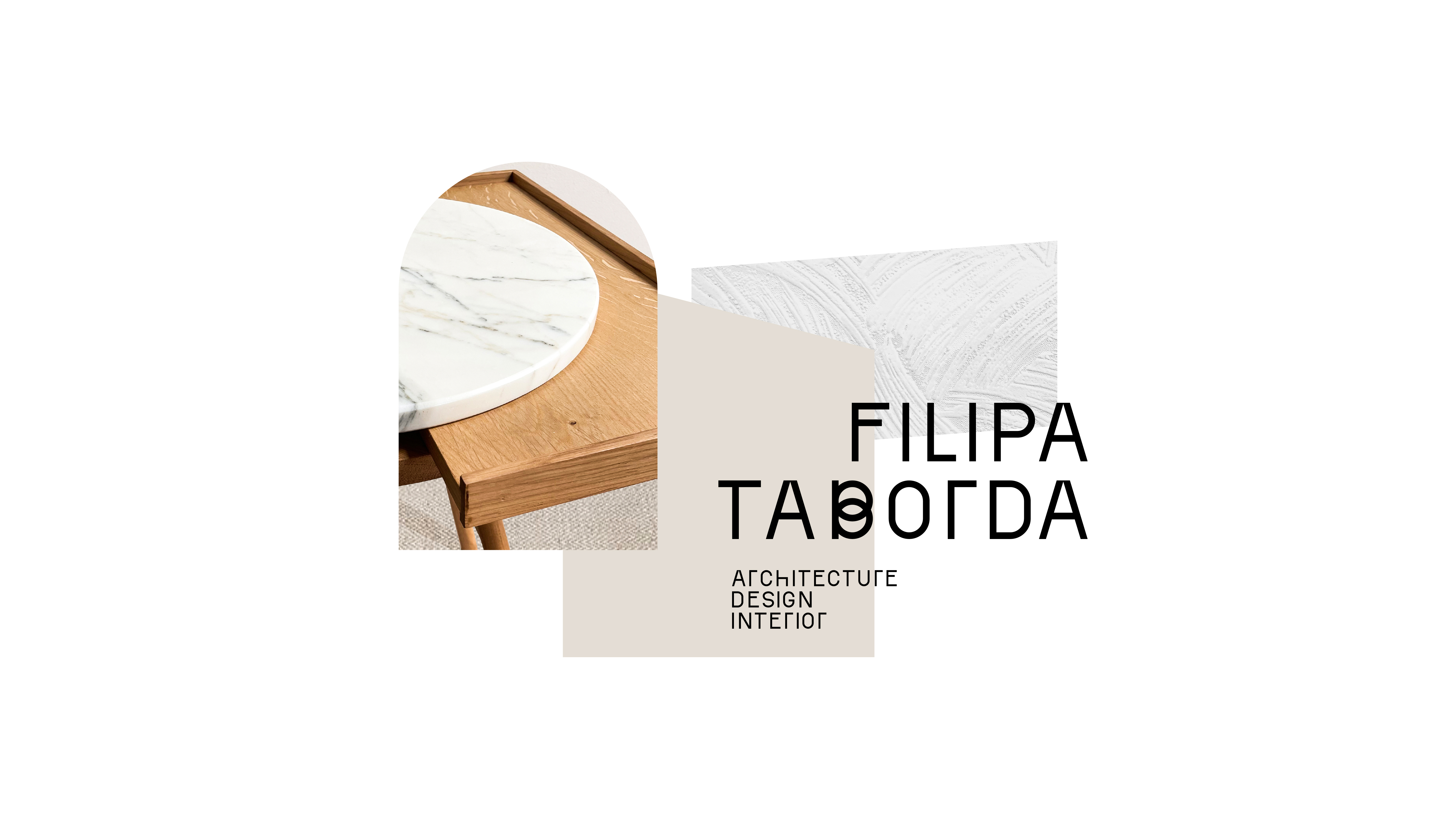
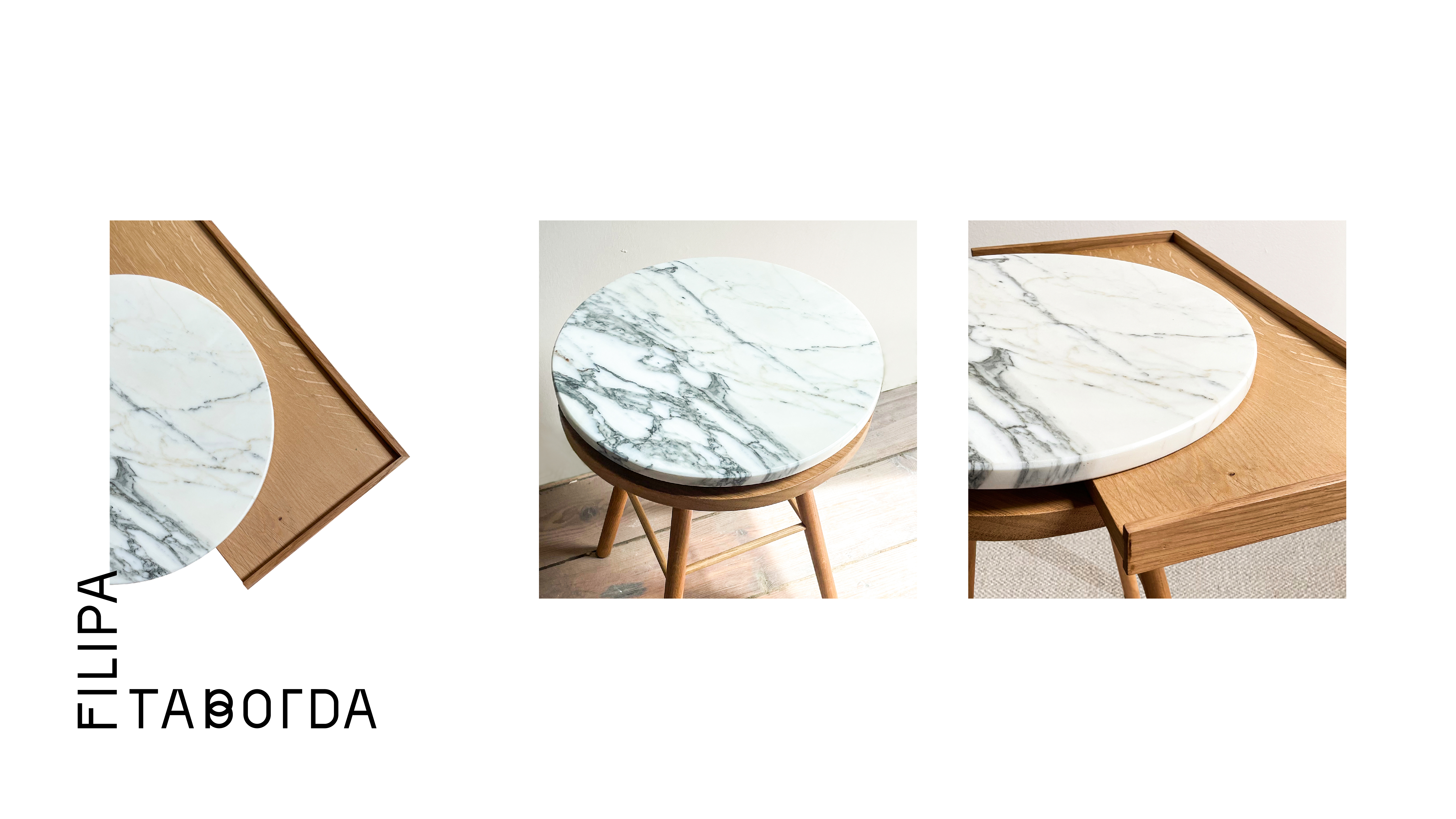
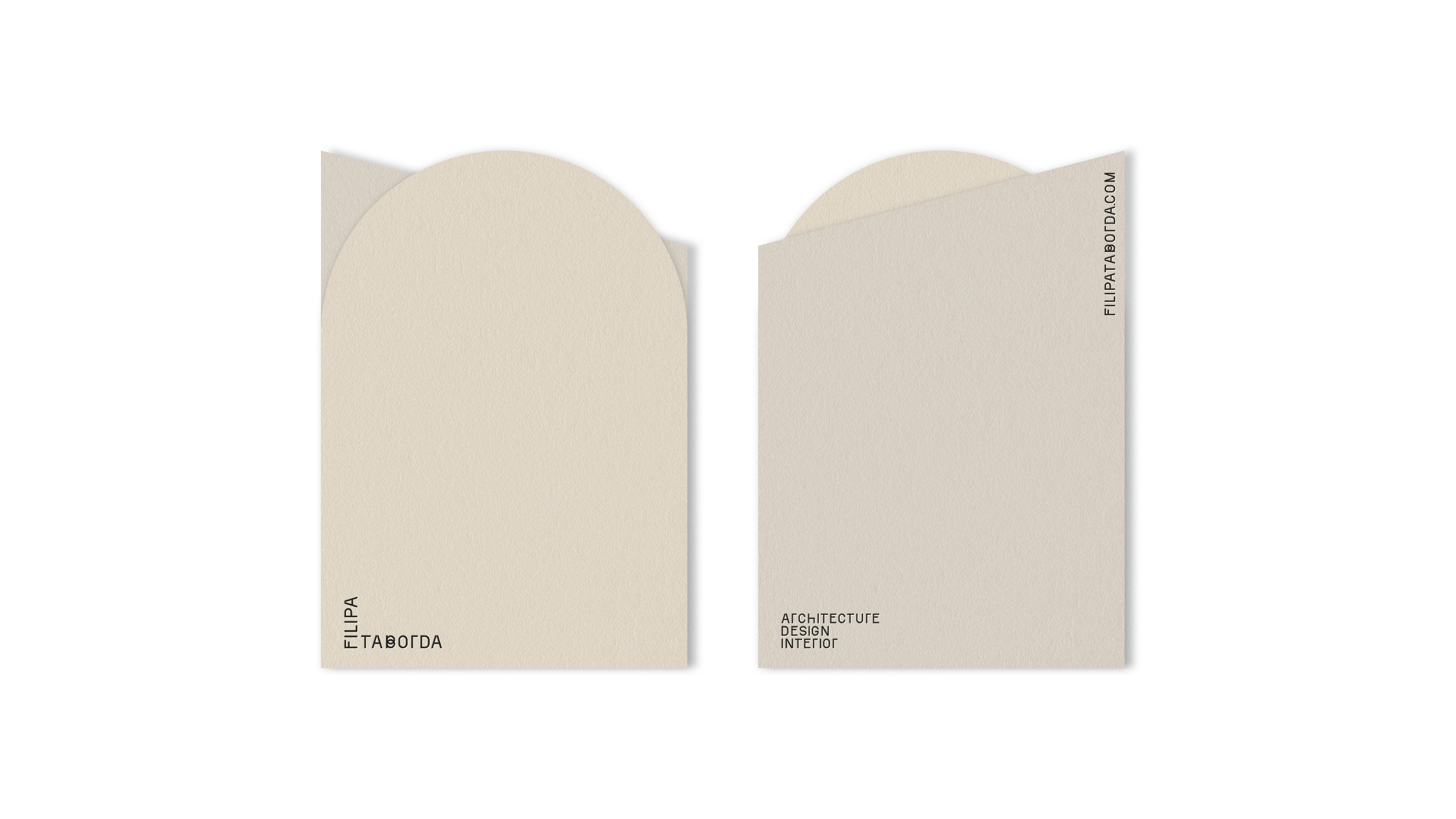
The visual identity translates this thinking into a flexible system of forms, balancing geometry and organic shapes. Inspired by architecture itself, the brand adapts to different contexts while maintaining a strong and coherent presence. It behaves like a space in constant transformation, capable of evolving without losing its essence.
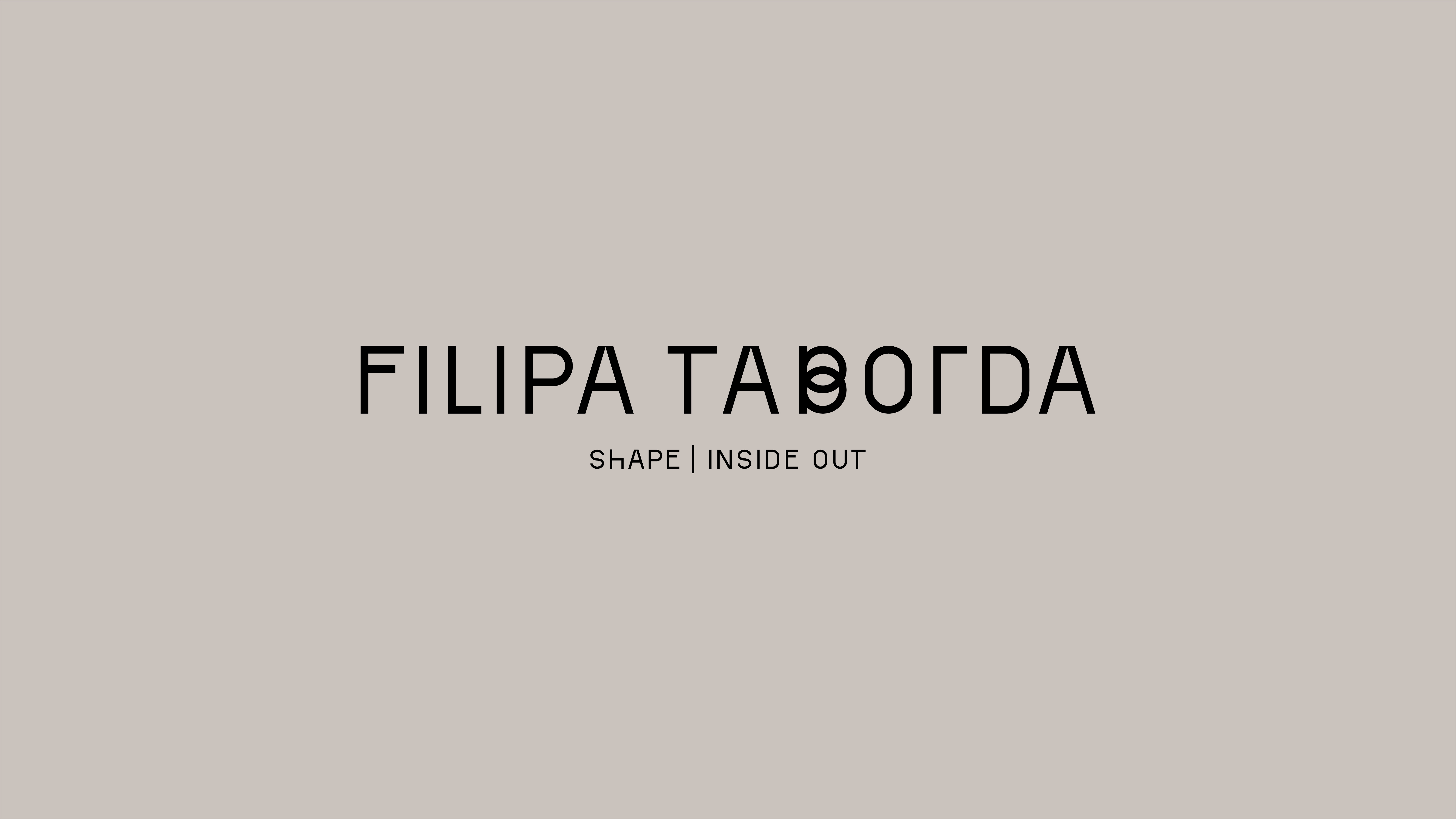
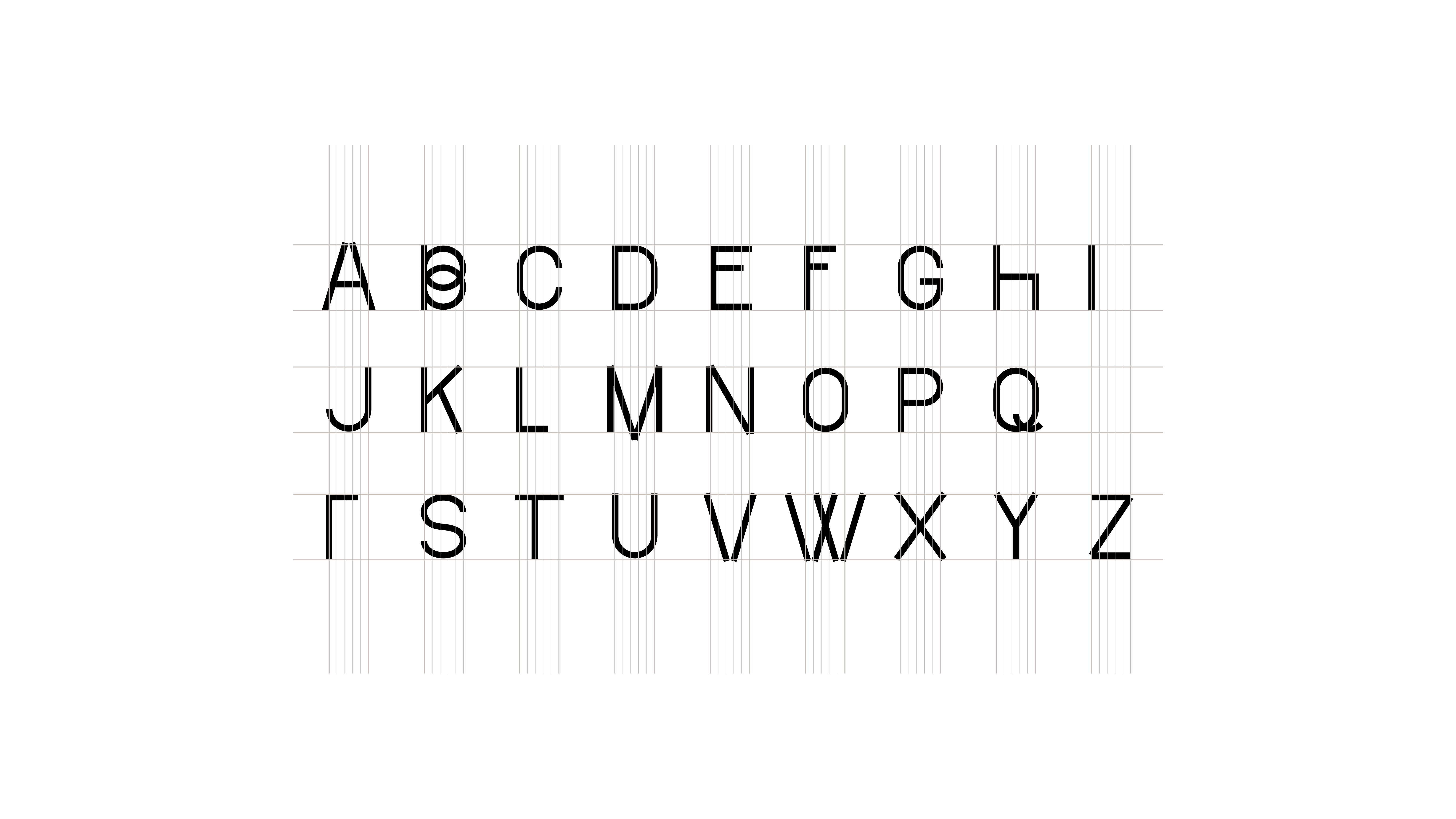
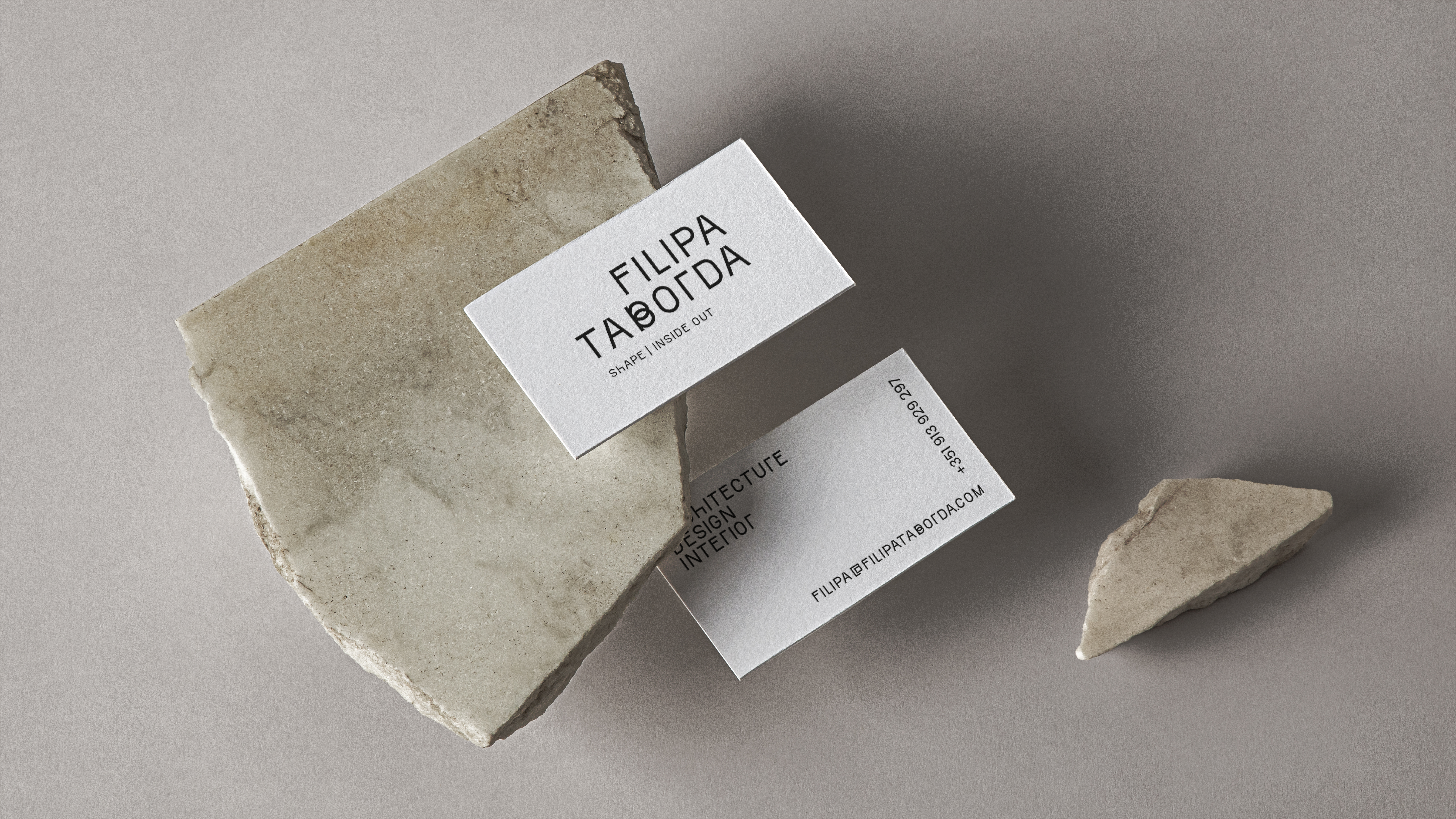
At the center of the identity is a custom typeface, designed to carry the brand across all touchpoints. Precise and versatile, it reinforces the idea that every detail matters, from the overall structure down to the smallest element.
The result is a brand that reflects the way Filipa works: thoughtful, adaptable, and deeply connected to people. A visual language that doesn’t just represent architecture, but expresses the experience of living it — inside and out.